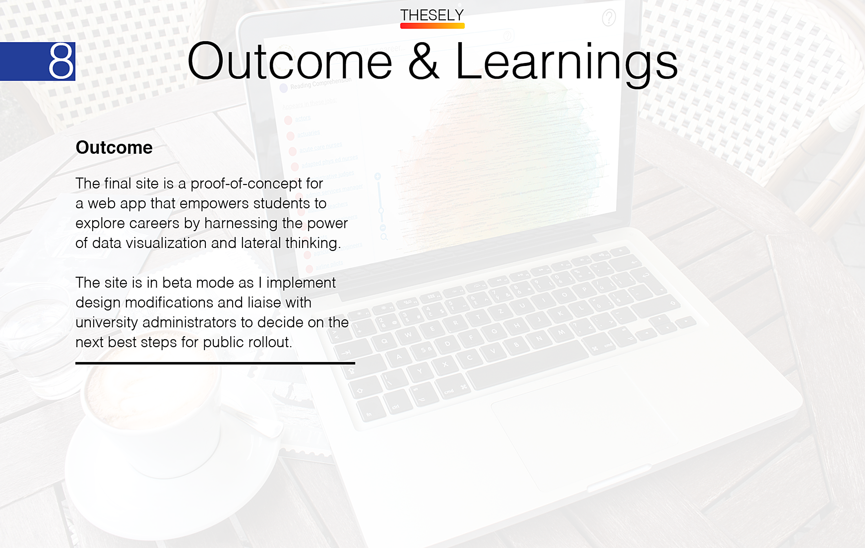
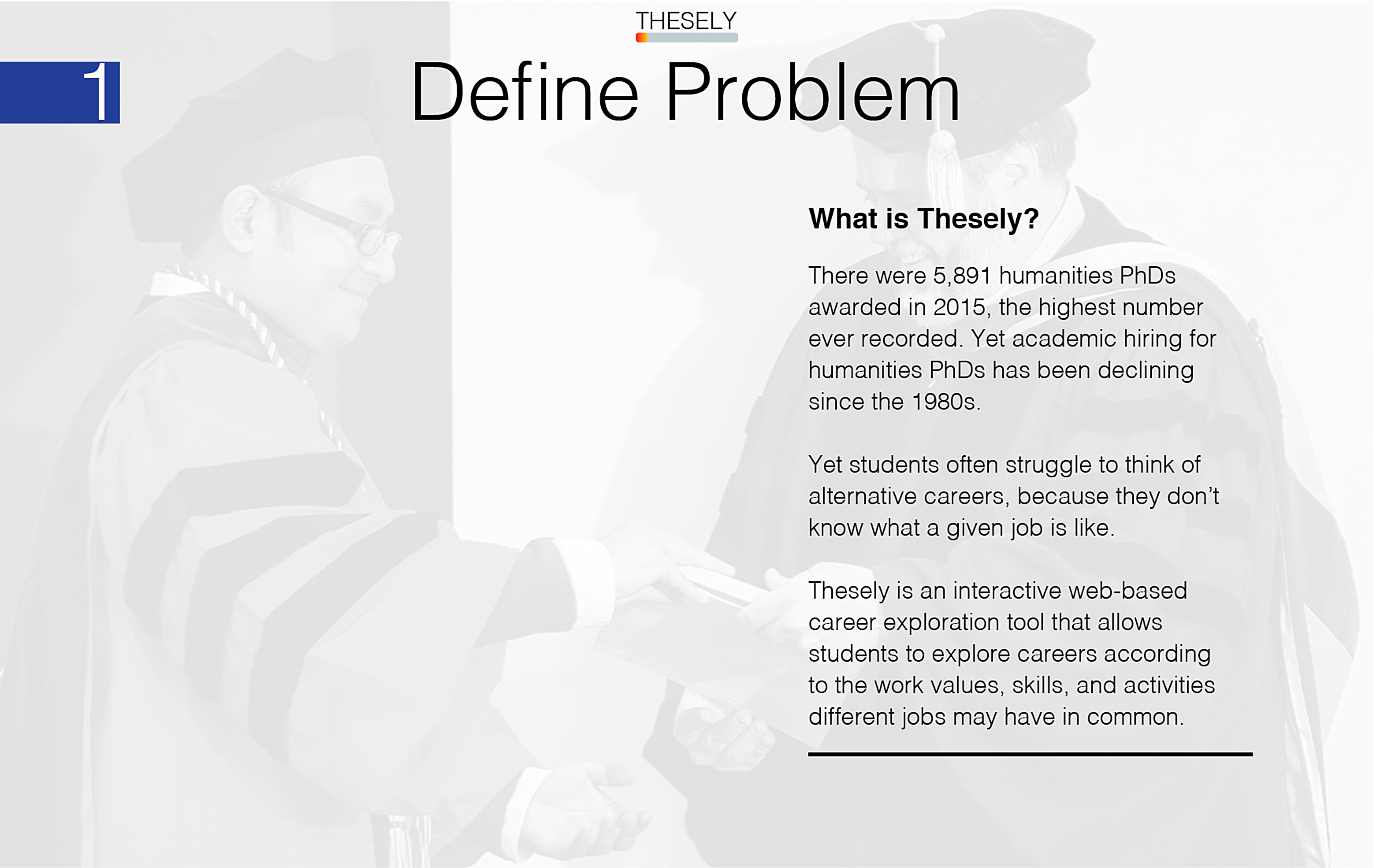
There were 5,891 humanities PhDs awarded in 2015, the highest number ever recorded. Yet academic hiring for humanities PhDs has been declining since the 1980s.
Asking students to think of alternative careers is often counterproductive. They may struggle to envision what career they might like, because they have no way of knowing what the job entails. This inhibits the self-confidence necessary to commit to exploring alternative careers, because many students simply resort to stereotypes as proxies for real understanding (such as, “I don’t like math, so I would hate data science”).
In short, we need a solution that gives students self-confidence, rather than sapping it, by instilling a sense that there are many possible careers that might satisfy a student’s interests, skills, and values.
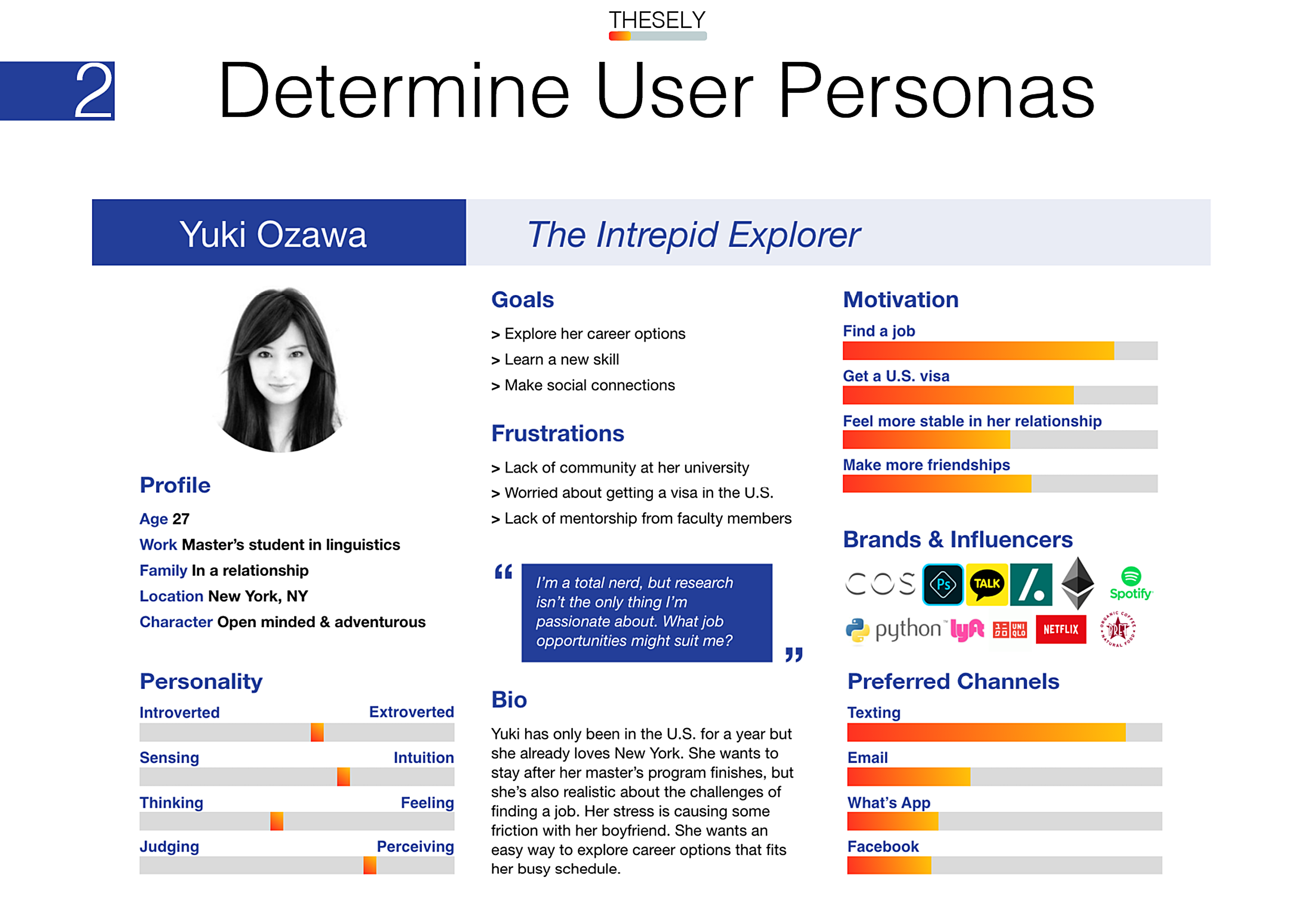
I need to build something that gives busy students, like Yuki, a low barrier of entry to quickly and easily discover new careers.
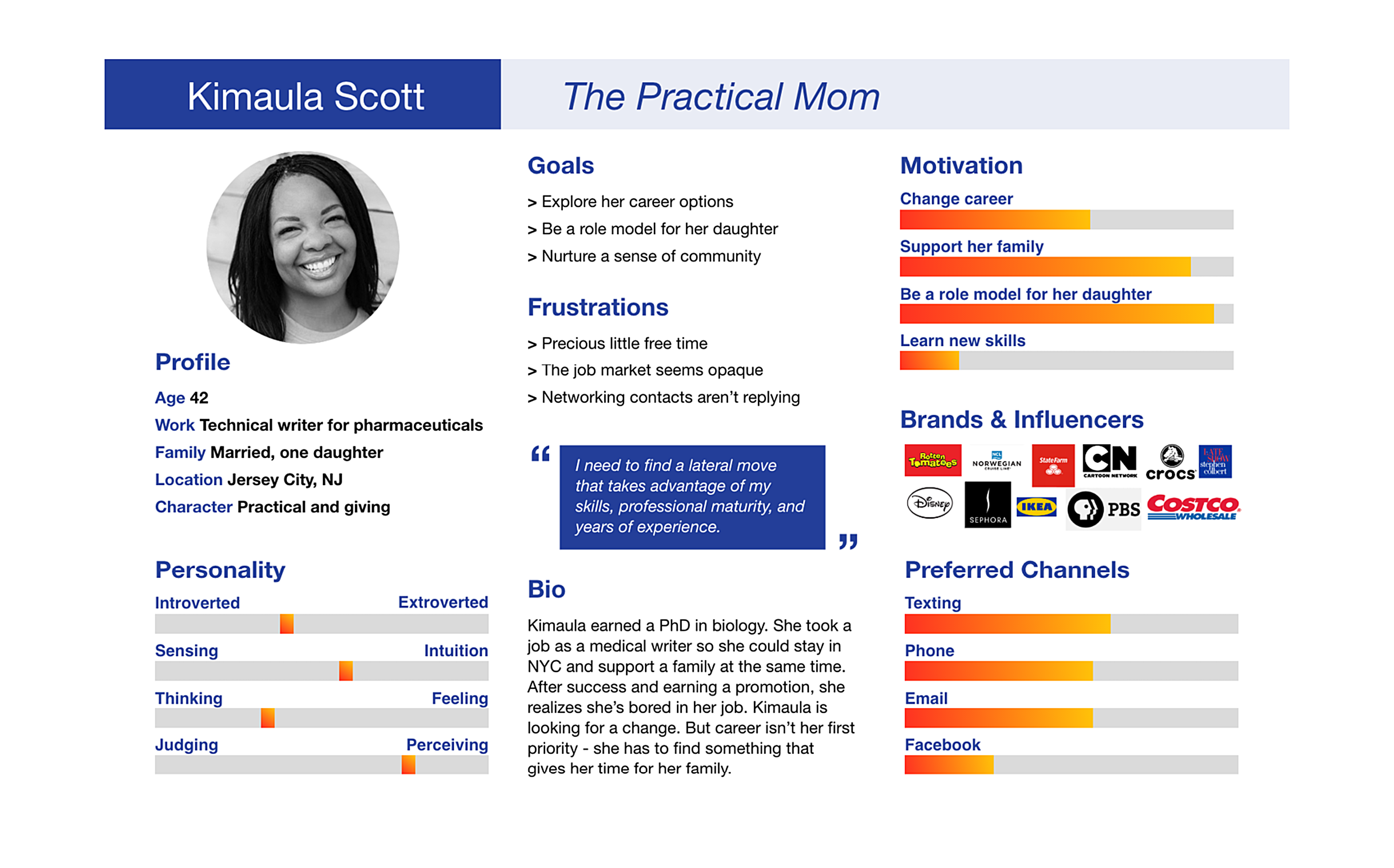
I need to build something that prioritizes skills and abilities, to let Kimaula know if she's on the right track. Ideally, Kimaula might even learn about skills and abilities she didn't even know she has, which she can list on her resume or cover letter. It also needs to be a solution that's accessible remotely to fit Kimaula's busy life.
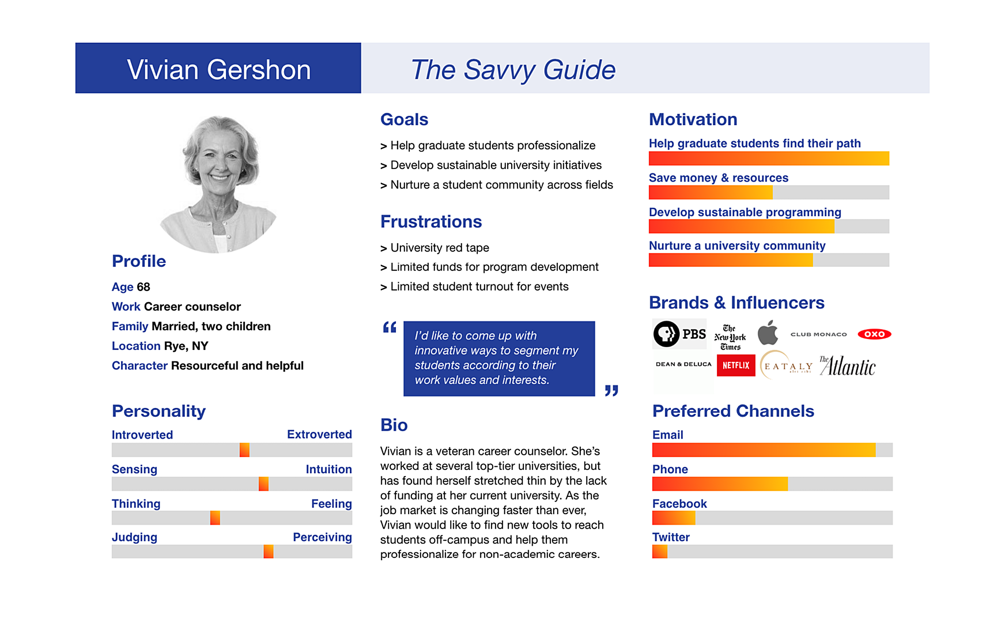
Finally, it should be a solution that prioritizes skills, abilities, and work values to help career counselors like Vivian design effective training and mentoring events.
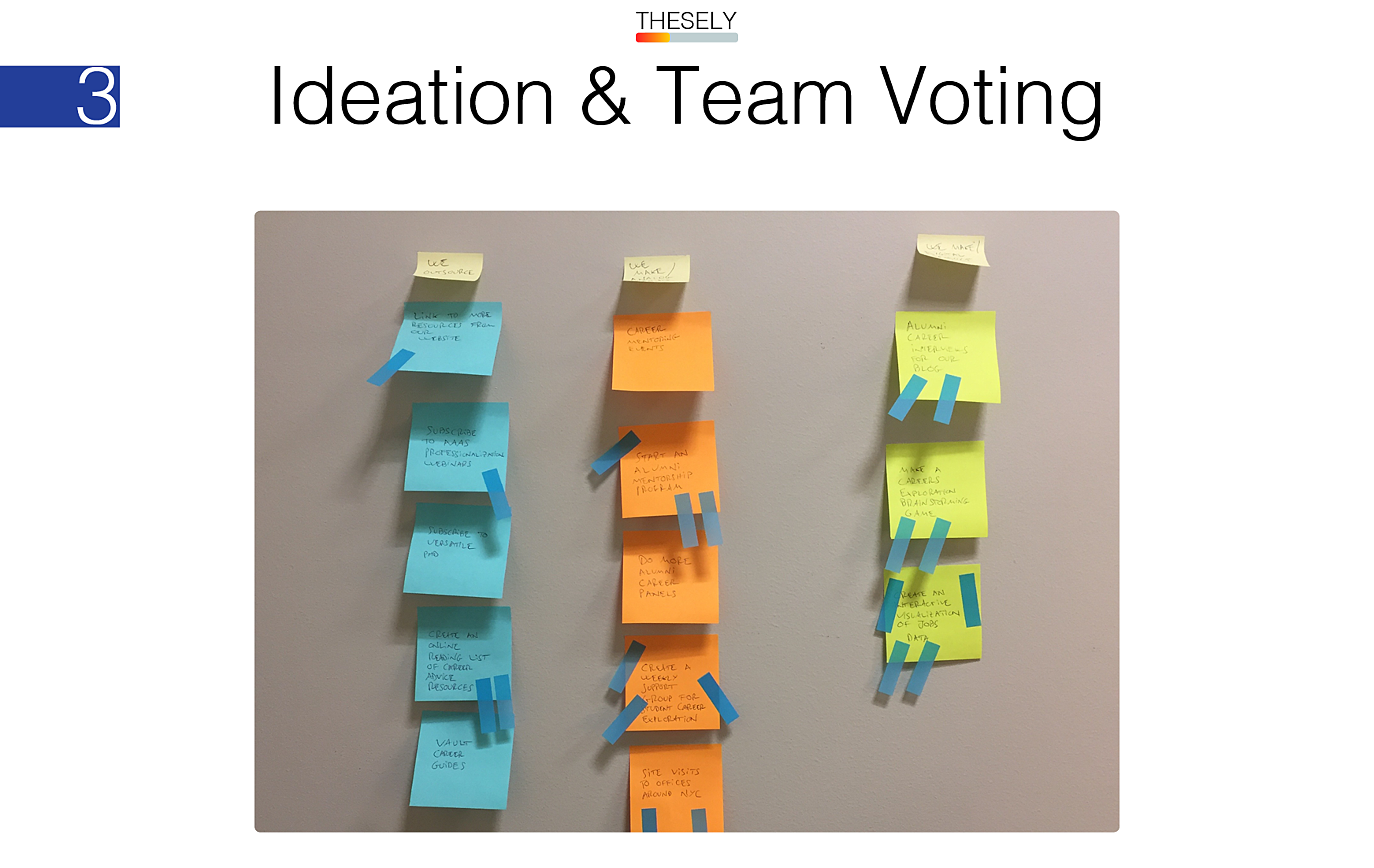
After using affinity diagramming to brainstorm and group possible solutions together based on their user value proposition, the seven members of our team at the Office of Career Planning and Professional Development voted by assigning three stickers each to their favorite ideas.
Creating a data visualization received the most votes because it met our users’ needs in an innovative way: visually engaging, accessible, and able to prioritize objective skills, abilities, and work values for any given career.
Job-search databases like Indeed.com allow students to apply to specific jobs. But what if they don’t know whether that job is a good fit for them? Thesely fills a gap in the formative stages of a student’s career exploration. By focusing on skills and values that are shared between jobs, Thesely leverages the power of lateral thinking to let users explore jobs they may not even know exist.
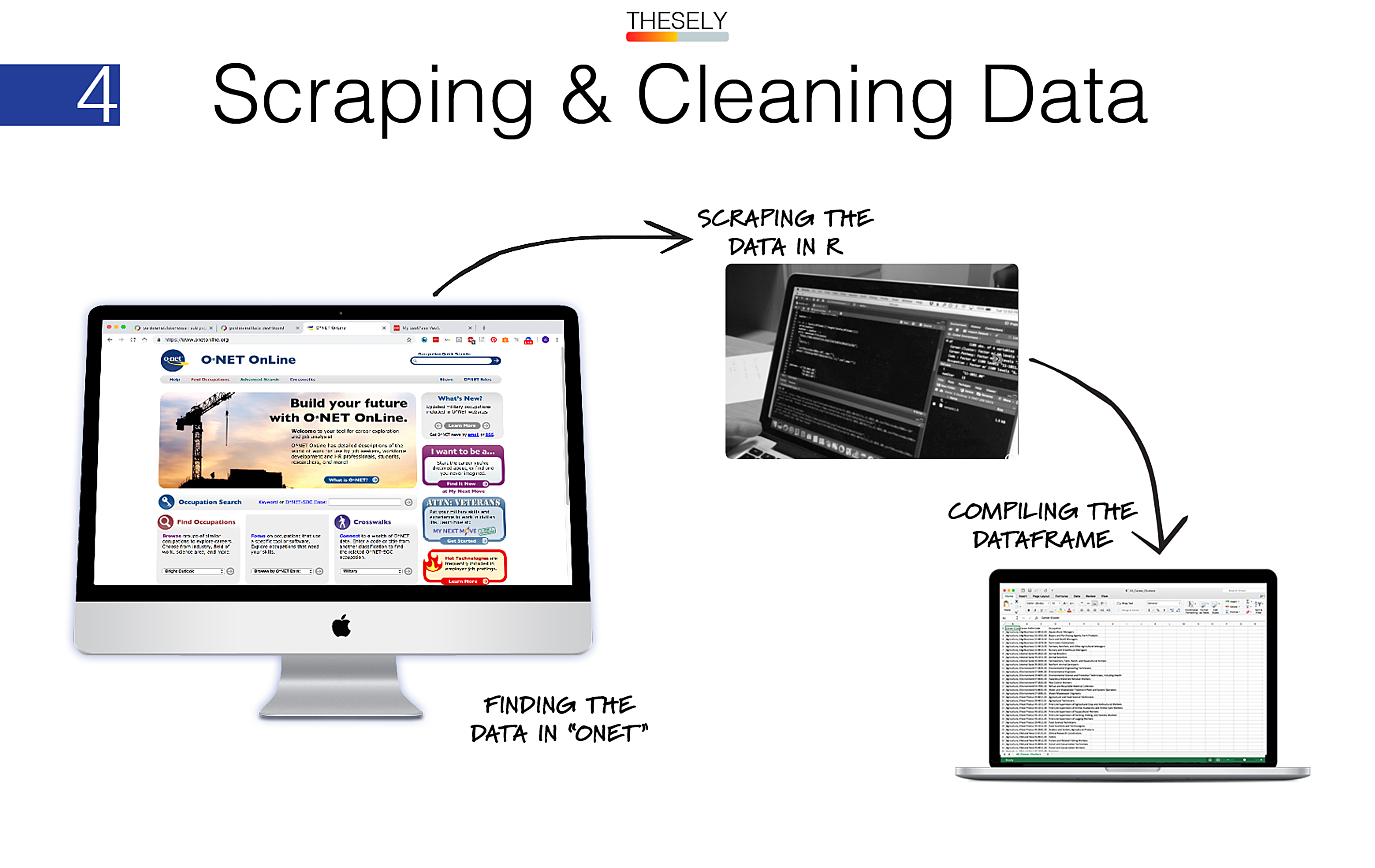
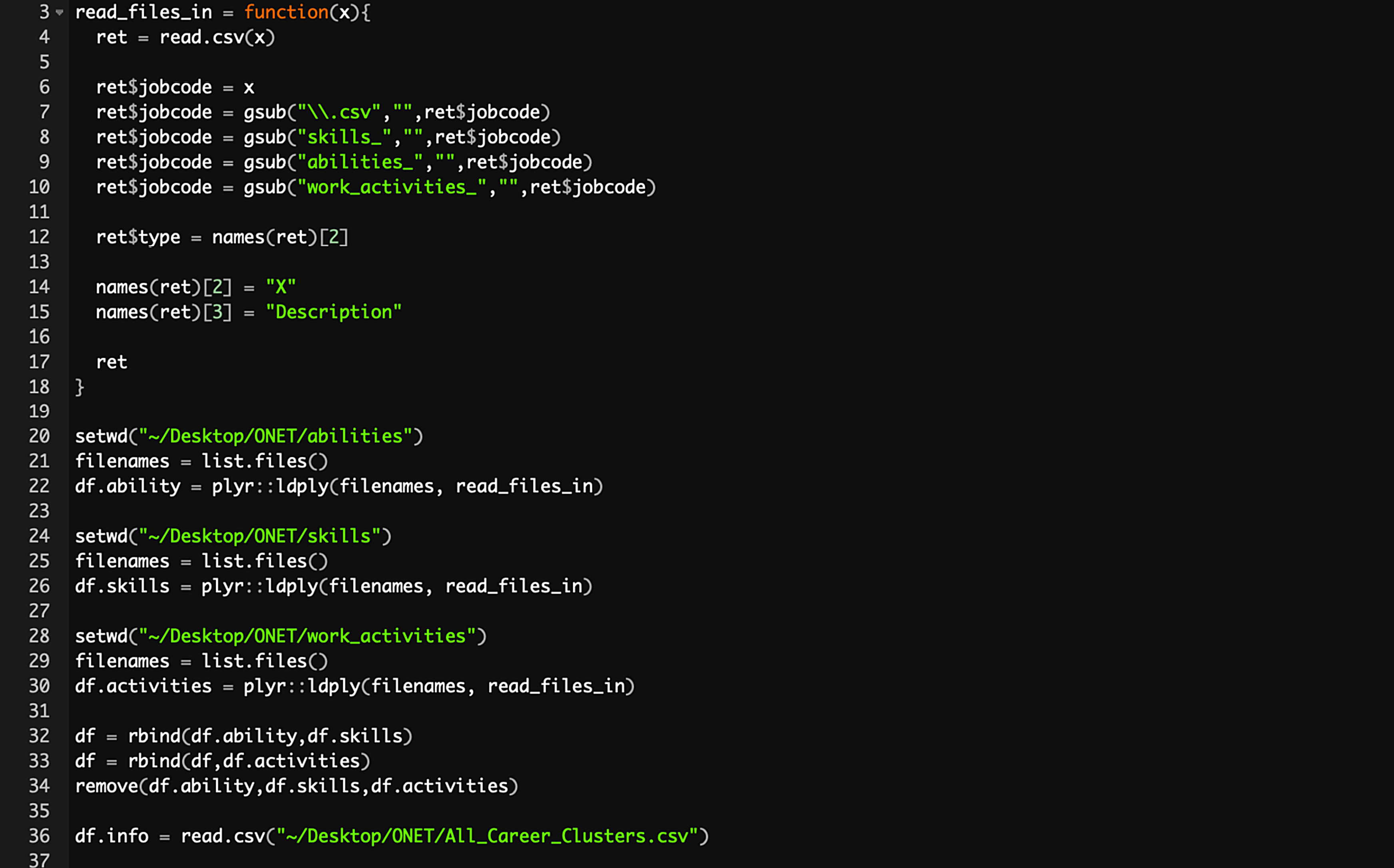
Collaborating with a big data statistician from my university, Christen Madsen, we used the R programming language to scrape jobs data from onetonline.org.
ONET is a government-sponsored database of almost 1,000 different occupations indexed by overlapping variables.
We cleaned, refined, and compiled over 120,000 lines of data using R.
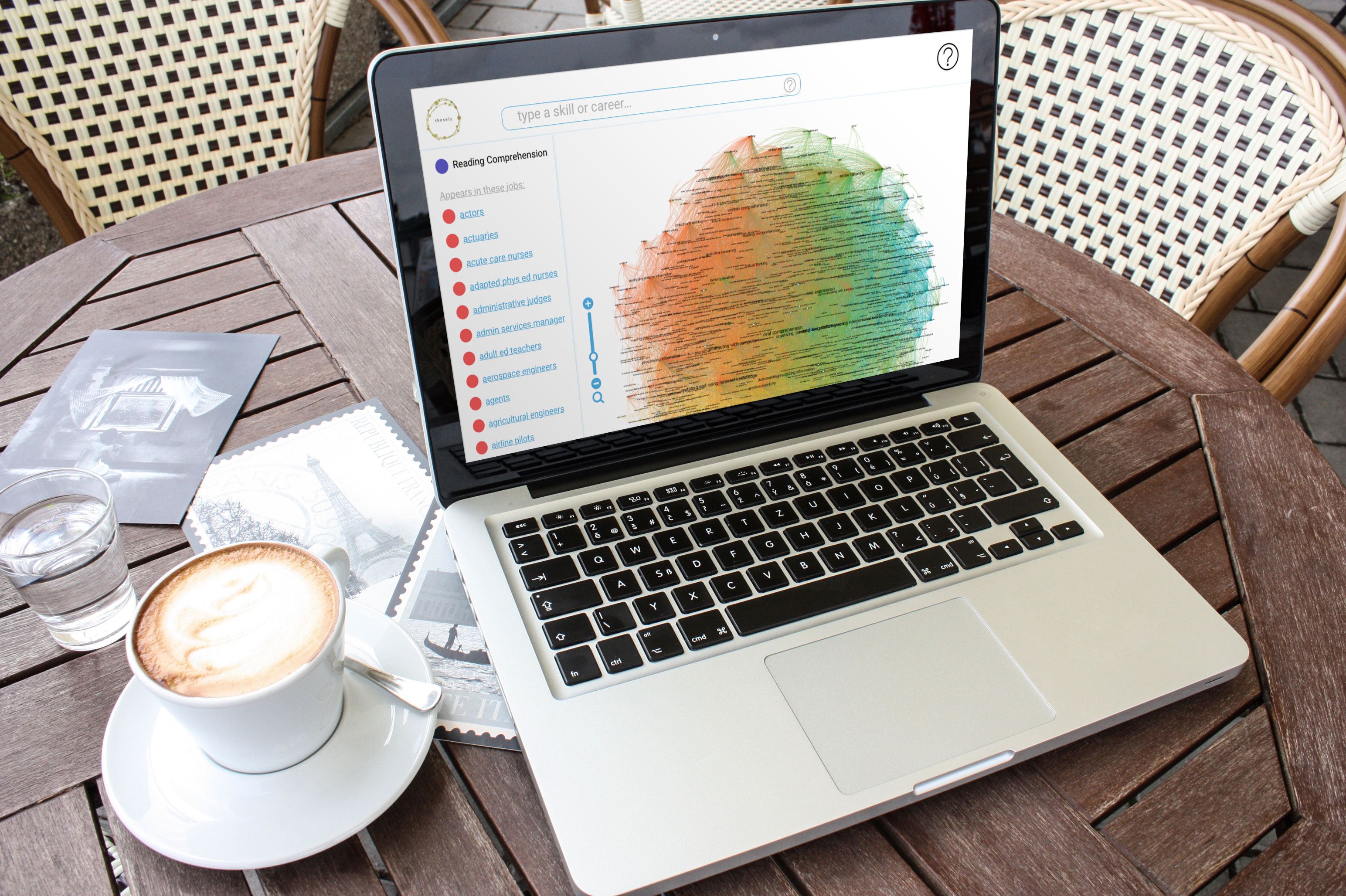
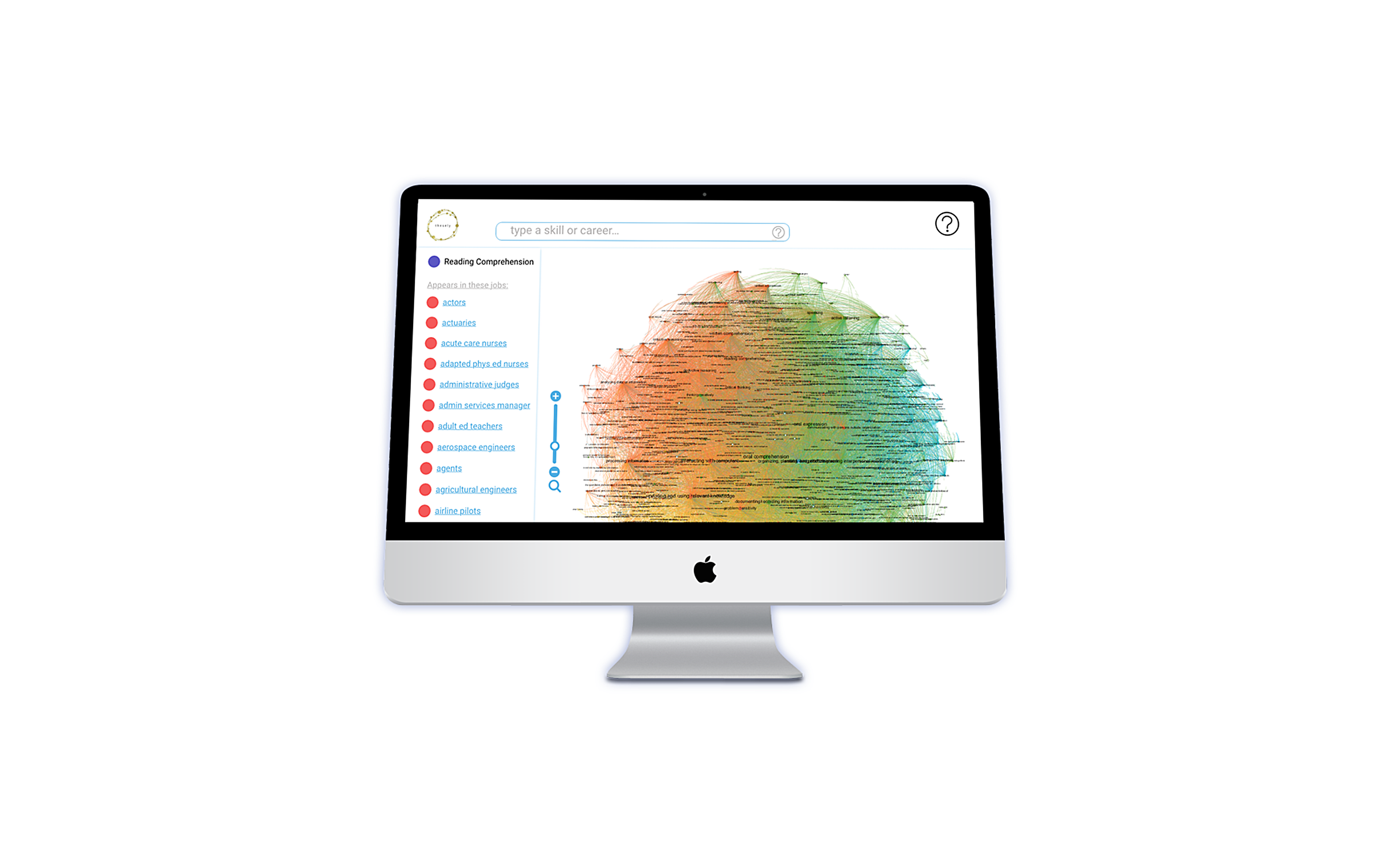
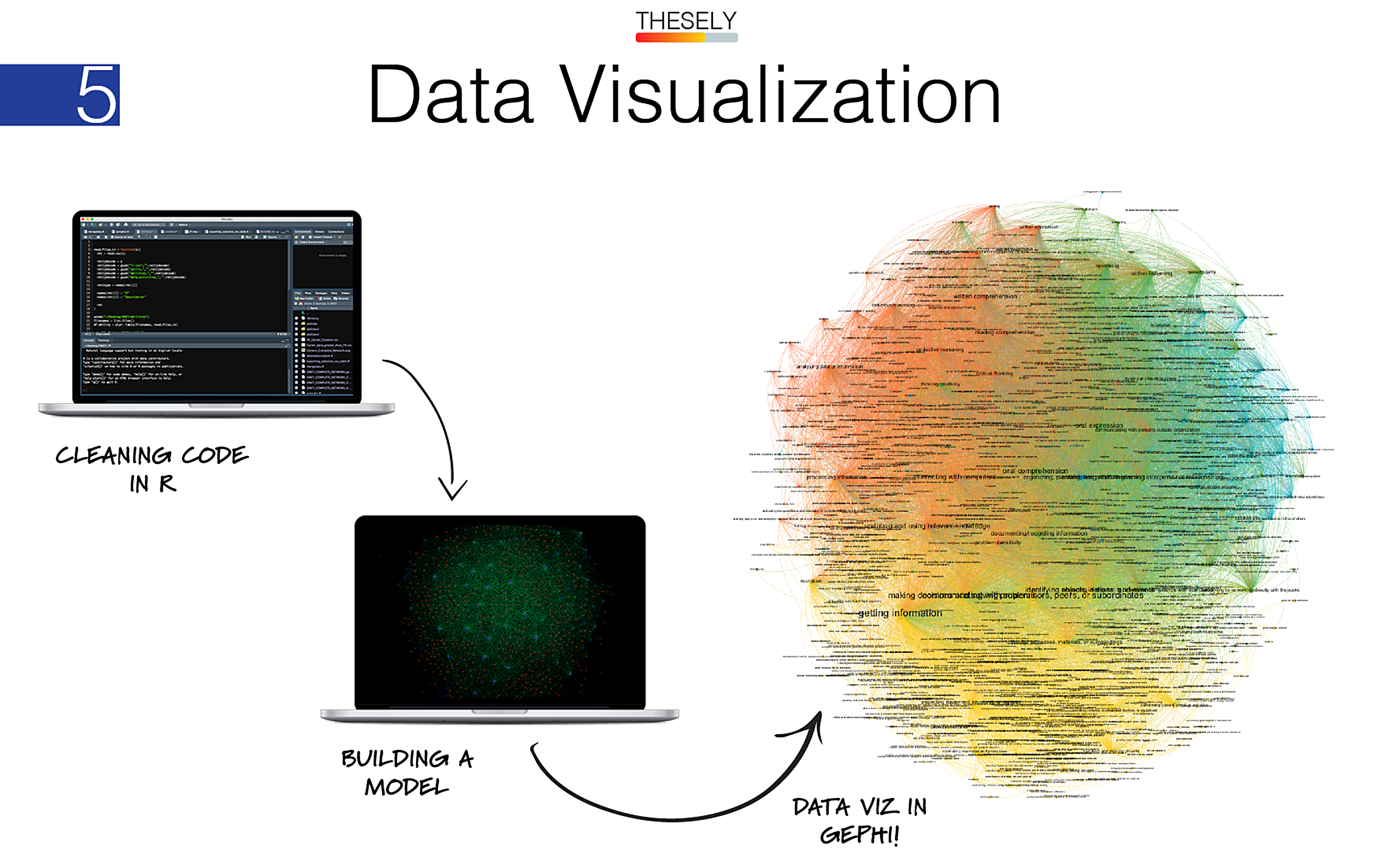
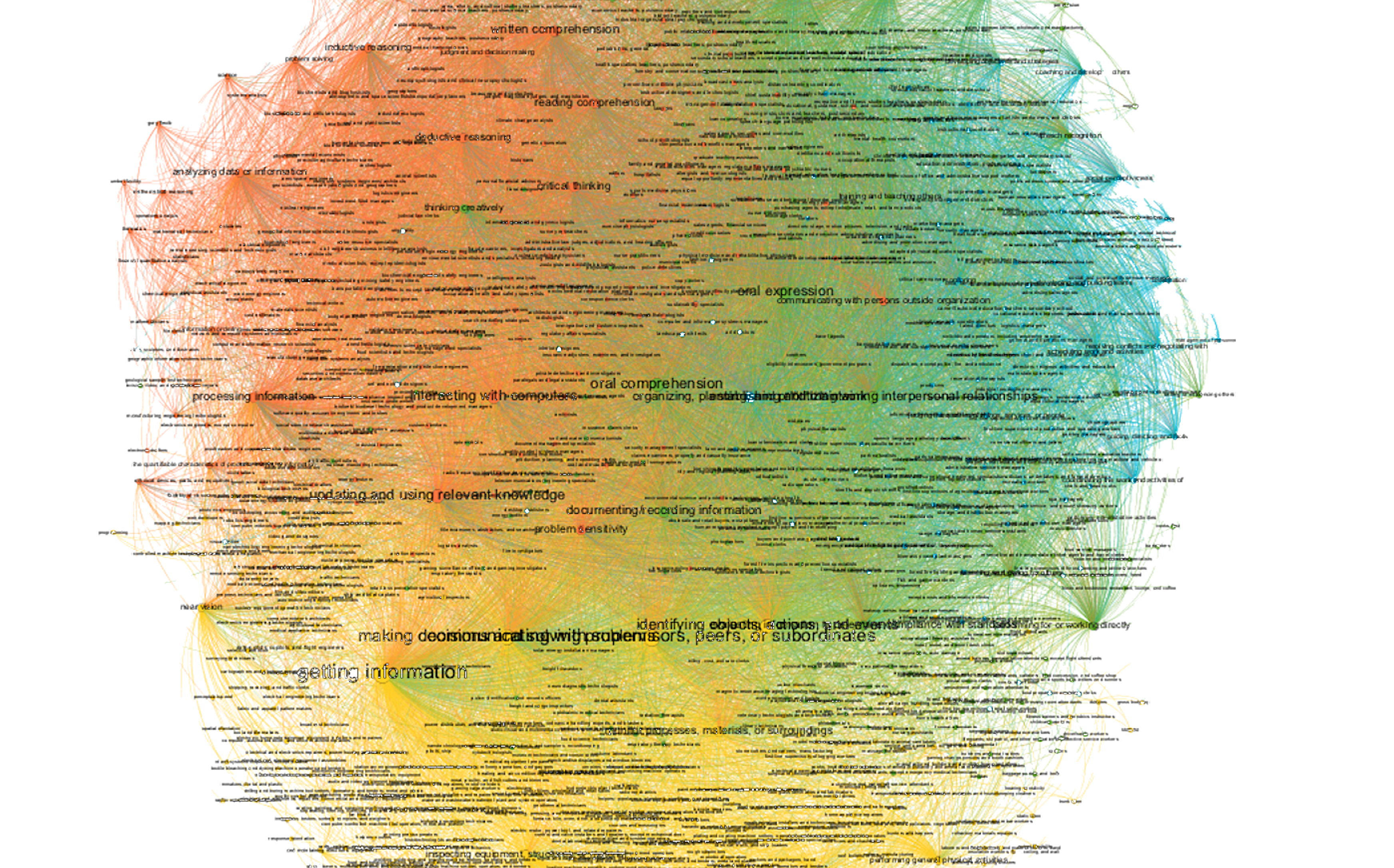
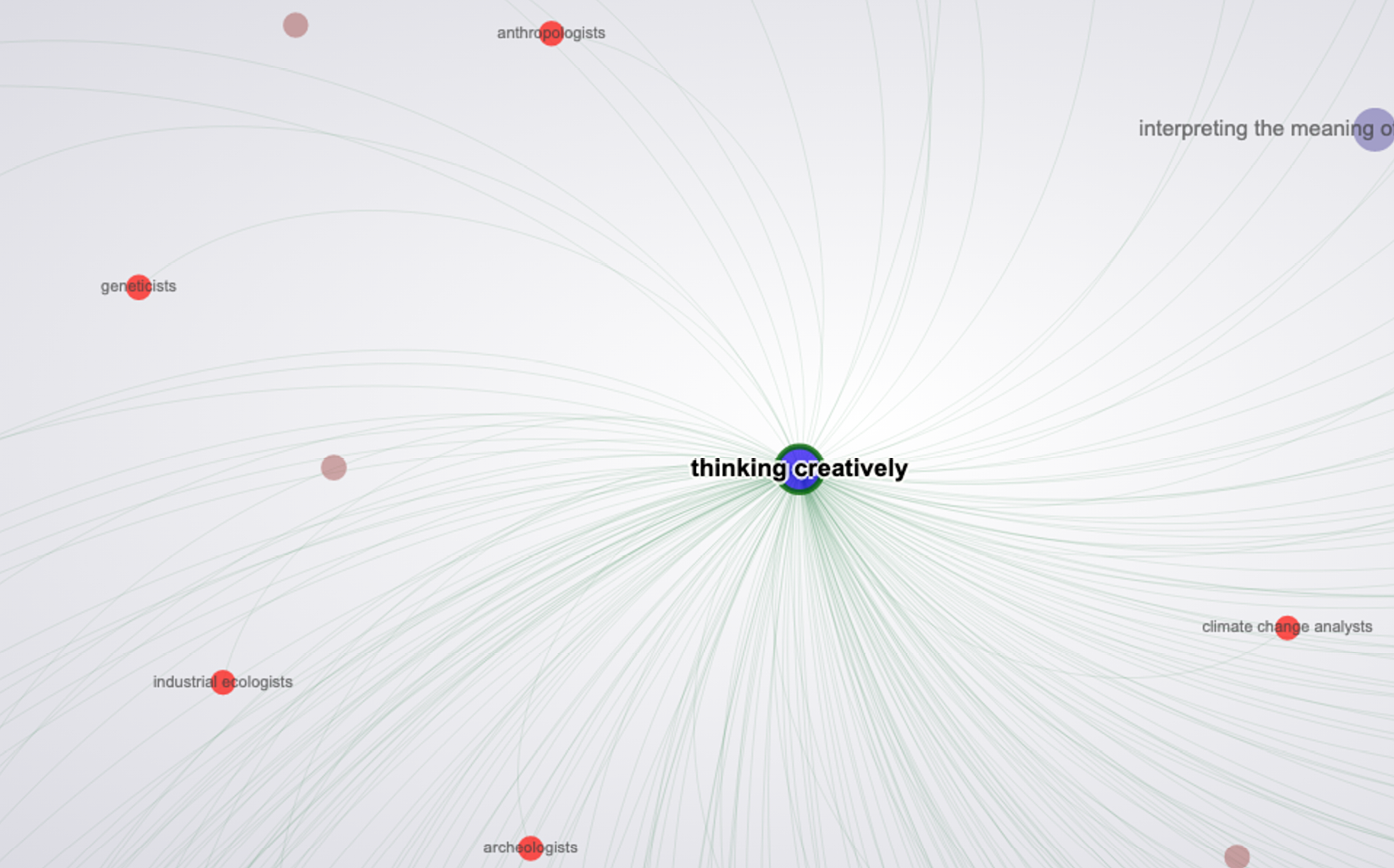
Next, I used the Gephi software package to visualize the data as a network made up of different jobs. The power of the network visualization is that it shows these jobs as proximately linked to each other based on the number of skills, values, and work abilities they share in common.
To enhance the user experience based on the needs of our target audience, I customized the visualization by removing all skills from the database that were not relevant to PhD students.
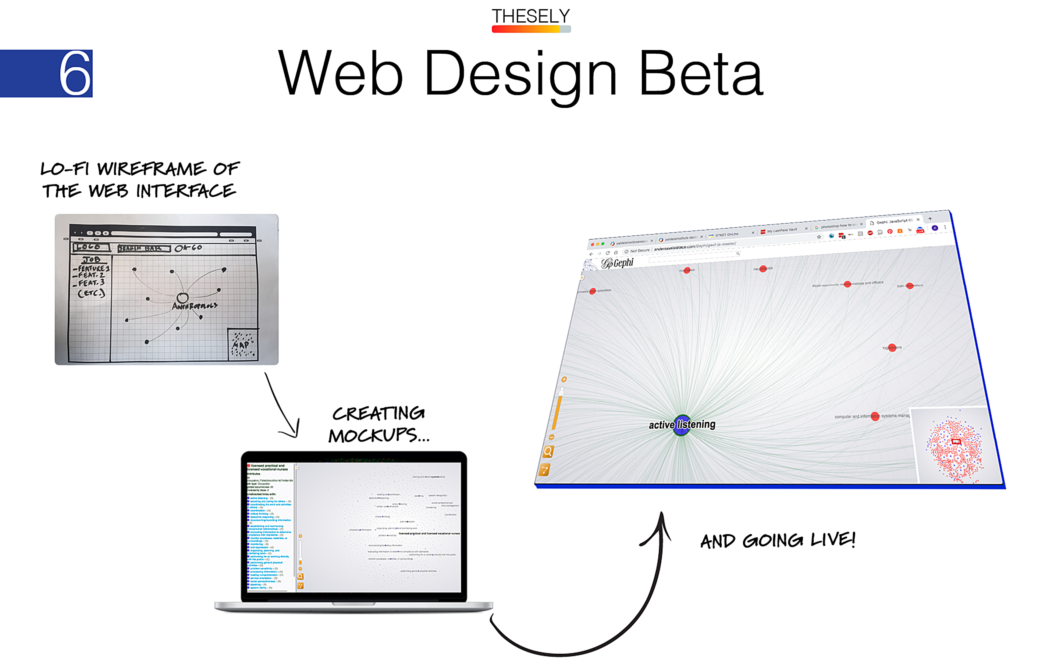
I created wireframes and mockups to prototype the final design of the site.
I exported the data visualizations from Gephi into an interactive website using HTML, CSS, and a customized Javascript codebase. Students can now access and interact with it from anywhere in the world.
The website has two other UX advantages. First, users can explore jobs inductively. This leverages the human brain’s capacity for understanding networks through what cognitive psychologists call spreading activation. Alternatively, users can search by simply typing a job or skill into the search bar and viewing all of the linked skills or jobs that are associated with their search term.
A magnifying glass icon activates a zooming function that increases the legibility of node titles as students explore the network.
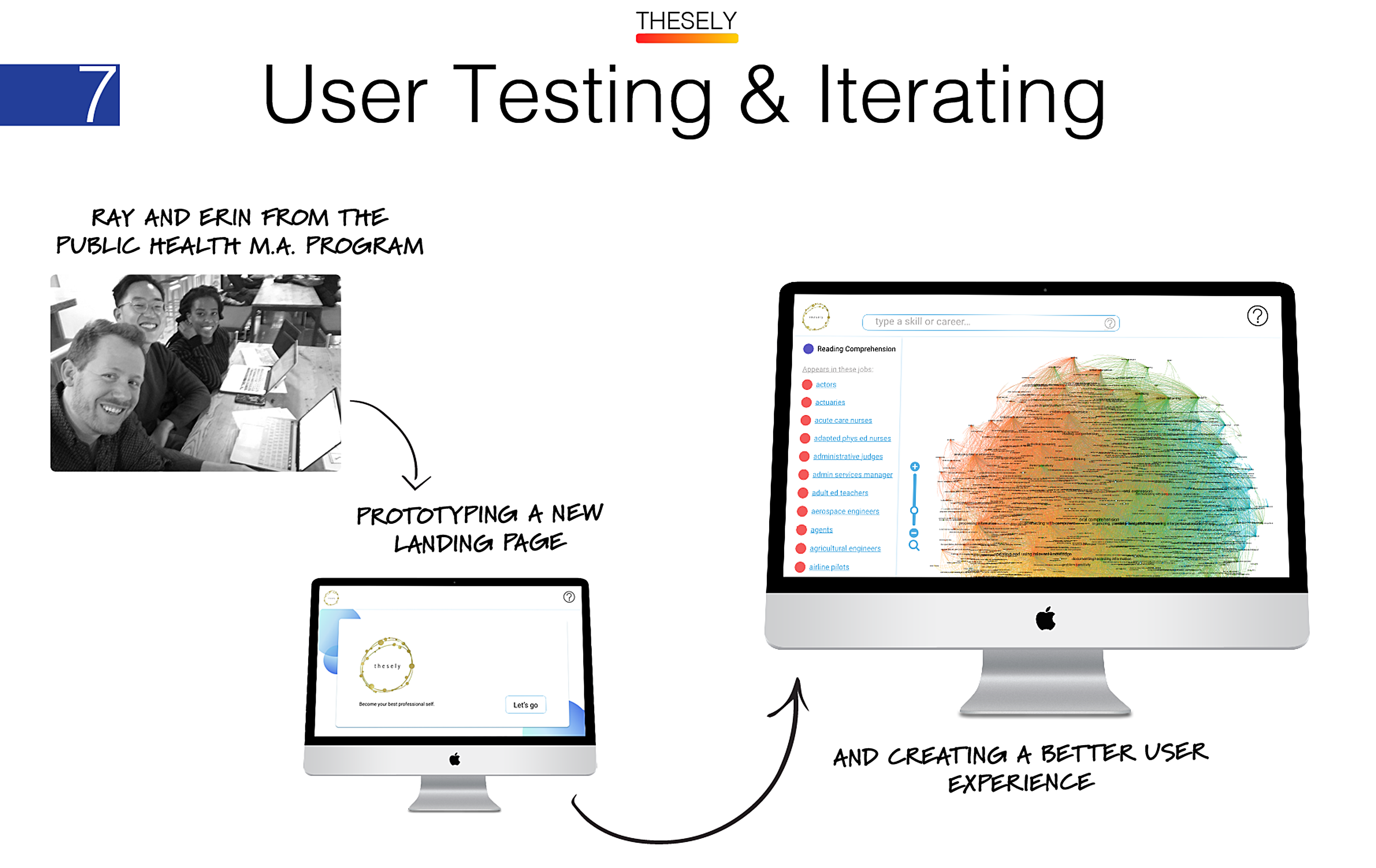
I recruited five students at the Graduate Center from different departments to perform usability testing and cognitive walkthroughs of the site.
I sorted feedback to identify three areas for improvement.
Based on this feedback, my next steps are to improve:
- Creating a new landing page that invites users into an experience of career and self-discovery.
- Building HTML links that take users from individual jobs to the corresponding job page on ONET.org to provide more information and functionality.
- Creating a help page that explains the project and user interface to new users.